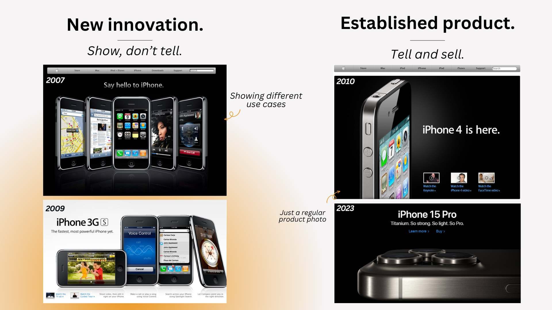
I stumbled upon old Apple websites and noticed...
...that back in the day, when smartphones were an emerging category, Apple focused on showing what you can do with an iPhone through screenshots.
Not just talking about specs, or lord behold, just how amazing the product is. (like they do now)

This makes sense.
In any emerging category or product, people need to clearly understand what they can achieve with it. What are the use cases…
(Remember the days when people didn’t understand why they’d need a smartphone?)
And the truth is, images can do a much better job at this.
That’s what we see from Wynter's B2B SaaS message testing data all the time as well.
People want to see what they can do with it. And how it looks.
They don’t want to merely be told about it.
Especially when the product is new and abstract. Or it makes some big claims.
So open your coat and flash your product on your marketing site.
Don’t be like the Apple of today. (you have nothing in common with them).
Be like the Apple of the past.
A little CRO fact as well.
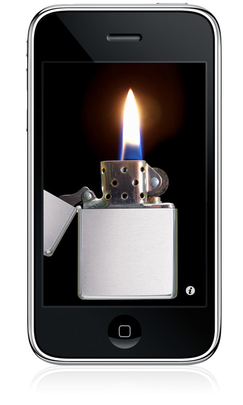
If Apple had shown the lighter app in the value prop, it would have sold 47% more iPhones in its first three years.


